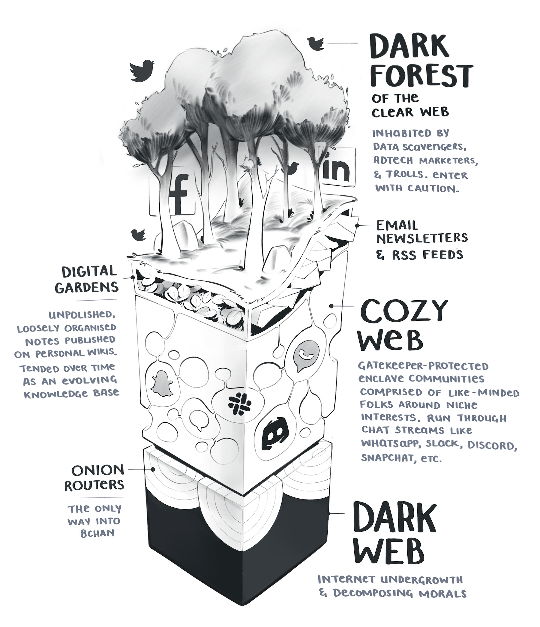
Much of effective learning comes down to simplifying ideas. Metaphors are a great tool for this. They don't have to only be limited to text. They can be visual (that's one of my favorite ways to explain things).
This recently made the rounds across the web but I didn't see it being shared within developer product circles.

Maggie Appleton is a "metaphor designer" and creates visual essays. She's a phenomenal illustrator, as evidenced by her work on her website:

Maggie illustrated this idea of the "Dark Forest", Cozy Web, and Dark Web as a forest visual metaphor and it's just so perfect. There's more to explore about the actual message and thoughts presented as it relates to developer communities – but we'll leave that for another time.
Visual metaphors can be used in tons of learning experiences like sales decks, courses, and roadmaps, as well as content marketing like articles. They are great for social media channels that emphasize visuals and when they really resonate, they could even be worth animating for the web.
Have a lovely day,
Kamran

